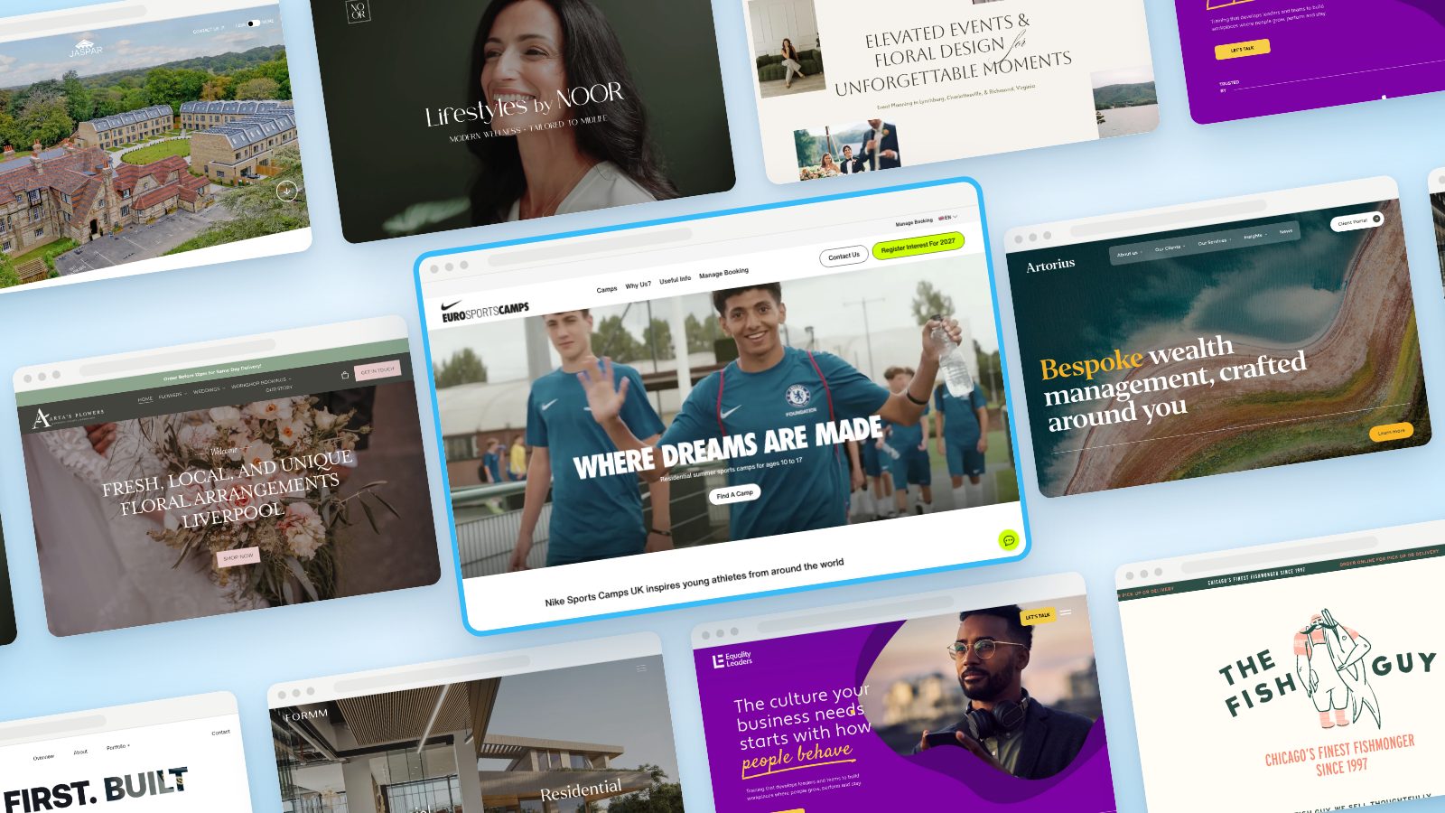
Most "best Squarespace websites" lists are a scroll of nice templates with the logo swapped. That's not what this is. Every site below has gone well past the template: custom code, bespoke layouts, illustration and animation that you won't find in the Squarespace template library.
Four of the ten were winners or runners-up at the 2025 Qube Awards, the awards for the Squarespace design community. The rest come from studios doing the most ambitious Squarespace work around right now, including by Crawford, Hulo and Design by Ency. One of them is ours. We checked that every one is still live on Squarespace in October 2026. Several award-winning sites have since left the platform, and we didn't include them.
We've been building on Squarespace since 2018. What we looked for here is the gap between "looks good" and "was clearly designed for this exact business". Every site below would have been hard to build from a template.
Nike Sports Camps UK
Of course we had to pick a SpaceWorks project for No. 1. It's our list, and we'd be lying if we said we hadn't seen this one coming. In our defence, we think it holds up.
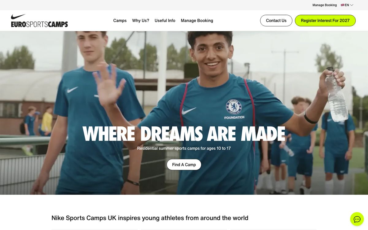
Euro Sports Camps runs Nike Sports Camps in the UK: residential summer camps for 10 to 17 year olds across nine sports, hosted at schools like Charterhouse, Winchester College and Bradfield College. Football runs in partnership with Chelsea FC, and campers of more than 100 nationalities attend every year.
- Industry
- Youth sports and residential camps
- Standout
- Five languages, a landing page per sport with age-based programmes, and prices with full inclusions shown upfront.
- Website
- eurosportscamps.com
Why it's on the list: parents, many of them overseas, are booking a week or two away for their child at over £2,000 a week. The site is built for that decision. It shows a 4.8 out of 5 rating from 245 verified reviews, answers the logistics questions on every camp page, and gives parents four ways in depending on how ready they are: book now, enquire, book a video call, or register interest for 2027. Families who've already booked get a "Manage Booking" link in the main nav.
Arta's Flowers
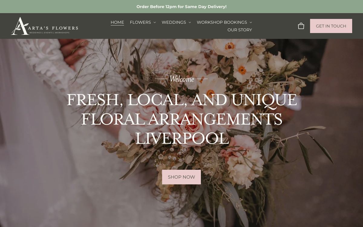
An independent Liverpool florist with shops on Lark Lane and at Exchange Flags, selling everyday bouquets, wedding flowers, workshops and corporate installations.
- Industry
- Florist and e-commerce
- Standout
- Same-day delivery with postcode coverage and fees listed upfront, sitting alongside a separate route for weddings and workshop bookings.
- Website
- artasflowers.co.uk
Why it's on the list: florists serve two very different customers. One wants flowers at their mum's door by 7pm. The other is planning a wedding a year out. Nick Croce at Design by Ency (No. 3 on our UK designers to watch list) gave each of them a clean path. The photography carries the brand and the shop is quick to get through. According to Ency's case study, online orders went up 50% after launch.
the4color
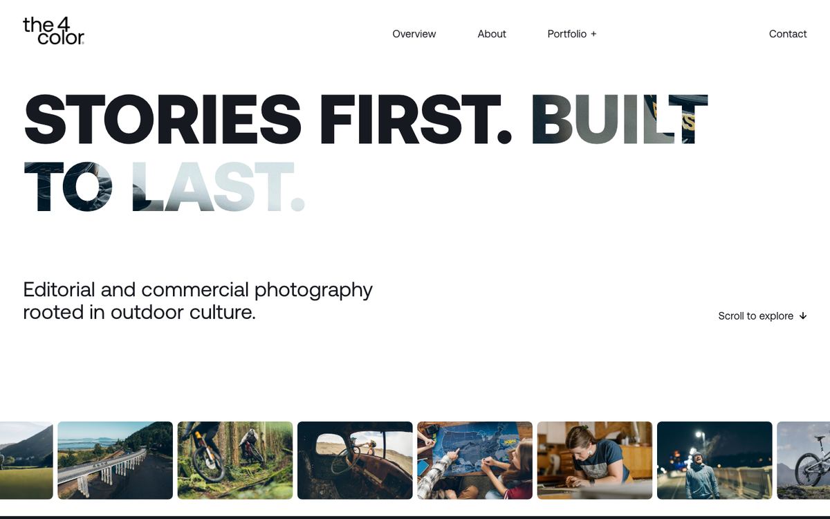
The portfolio of Anthony Smith, an editorial and commercial photographer shooting outdoor culture (cycling, skiing, endurance sport) for brands like Patagonia, Arc'teryx, REI, SRAM and Red Bull.
- Industry
- Photography and creative production
- Standout
- Photography that plays through the letters of the homepage headline, and a filmstrip of recent work running underneath it.
- Website
- the4color.com
Why it's on the list: this is about as custom as Squarespace gets. Hulo built a custom front end inside the Squarespace framework, with GSAP animation and ten custom page templates so every gallery gets its own layout. Hulo's case study reports load times 51% faster than average, even with all that high-res imagery. Most photographers on Squarespace use a grid template. This one feels like an editorial magazine.
Artorius
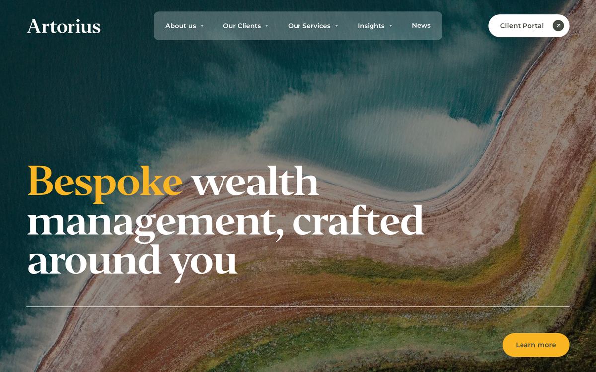
A UK wealth manager and multi-family office with offices in London and Manchester, looking after high-net-worth families, business owners and private equity professionals.
- Industry
- Wealth management and financial services
- Standout
- Aerial landscape photography and an editorial serif with gold accents, instead of the usual stock handshake and skyline.
- Website
- artorius.com
Why it's on the list: financial services sites are nearly always forgettable. Sam Crawford's studio, by Crawford, gave Artorius something that feels more like a private bank than a template: calm, expensive and confident. It still does the practical work too, with a client portal link, award credentials and clear routes for each type of client. Fun fact: bycrawford.com itself was developed by Hulo, the studio behind No. 3, from by Crawford's designs.
Lifestyles by Noor
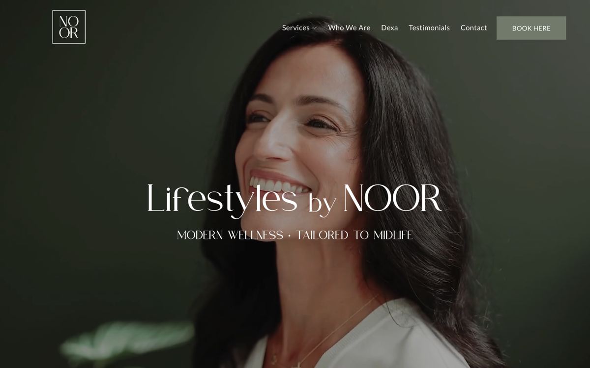
A physician-led midlife wellness clinic in Exeter, New Hampshire, focused on hormone health, menopause care, nutrition and DEXA scanning.
- Industry
- Healthcare and wellness
- Award
- Qube Awards 2025, Best Storytelling Website
- Website
- lifestylesbynoor.com
Why it's on the list: medical sites tend to feel clinical. This one opens with the founder's face and her own story, and is built around how patients want to feel ("heard and seen") rather than a list of treatments. Skyhouse Creative did the brand and the site together, and it shows. A large services mega menu, payment plans and FAQs are all there, but they never get in the way of the story.
Equality Leaders
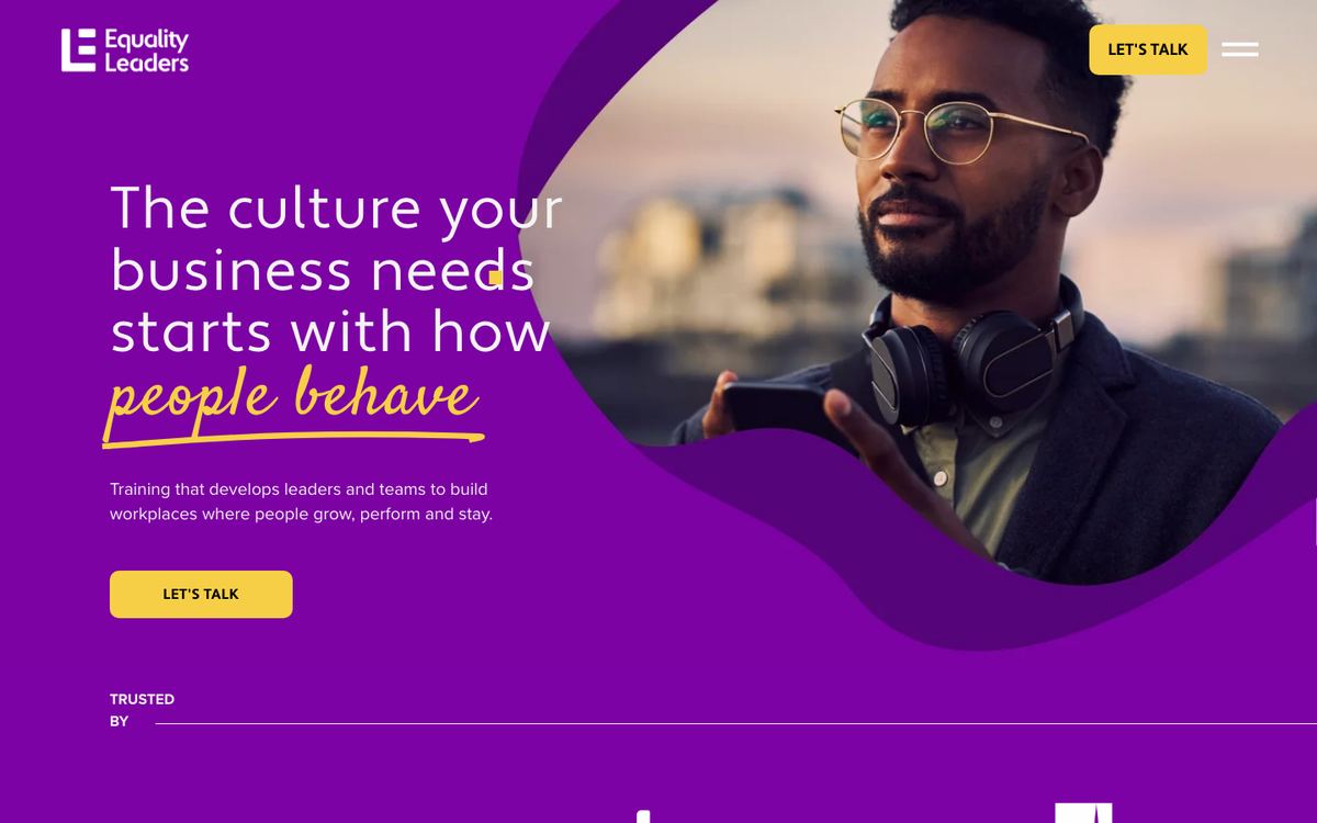
A workplace culture consultancy running leadership training, culture labs and consultancy for clients including Siemens, PepsiCo, Aviva, Sky, NatWest and Coca-Cola.
- Industry
- B2B training and consultancy
- Award
- Qube Awards 2025, Best Website Animations
- Website
- equalityleaders.com
Why it's on the list: B2B consultancy sites are usually the dullest on the internet. This one is loud on purpose: saturated purple, organic animated shapes, a hand-written accent in the headline. The motion is custom and it gives a training business real energy, while the client logos and case studies (Aviva, the Royal Navy) do the credibility work underneath.
Formm Studio
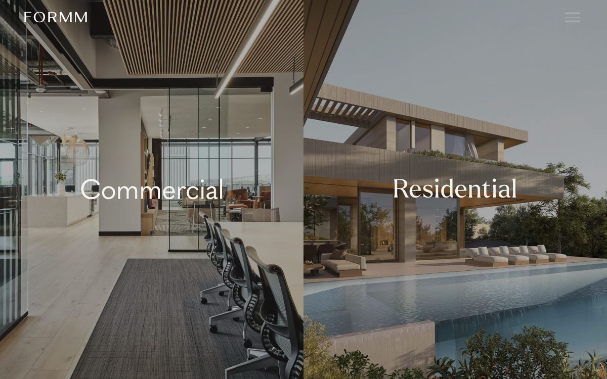
A US architecture and interior design studio working on commercial and residential projects.
- Industry
- Architecture and interiors
- Standout
- A homepage split straight down the middle: Commercial on one side, Residential on the other, each a full-height image.
- Website
- formmstudio.com
Why it's on the list: the whole site works like the studio's buildings: minimal, precise and with nothing extra. Two clients, two doors, and you pick yours before reading a word. Hulo designed and built it, with subtle motion and editorial type, and reports a 98% performance score at launch. It's a good reminder that "custom" doesn't have to mean busy.
Jaspar Group
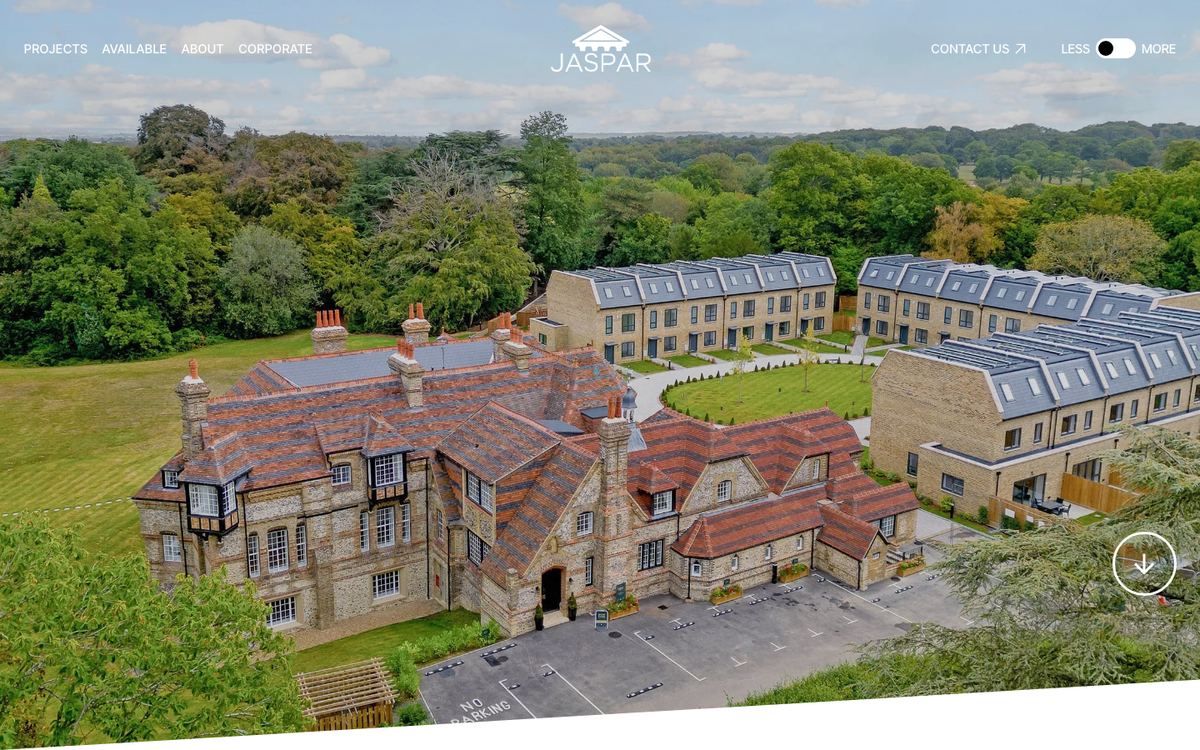
A residential developer converting historic buildings and building new homes across London and the South East, in places like Stanmore, Leatherhead, Putney and Chichester.
- Industry
- Property development
- Standout
- Full-bleed drone photography on the homepage, and a projects section you can filter by Coming Soon, Available and Completed.
- Website
- jaspargroup.co.uk
Why it's on the list: developer sites usually feel like a brochure PDF somebody uploaded. This one feels like a premium property brand. The aerial shot of a converted country house does more selling than a paragraph could, and the project status filters mean a buyer can go straight to what's on sale now. Clean, confident and very British.
Max & Dexter
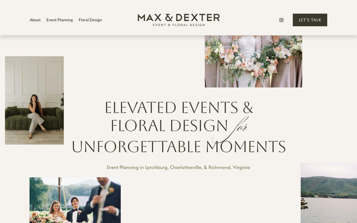
An event planning and floral design studio in Lynchburg, Virginia, working on weddings, corporate events and fundraisers across Central Virginia.
- Industry
- Events and floristry
- Award
- Qube Awards 2025, Best One-Page Website
- Website
- maxanddexter.com
Why it's on the list: one-page sites usually mean "not much to say". This one fits two services, three planning tiers with published prices (from $2,500 to $6,000+), testimonials and a three-step consultation process onto a single scroll, and it still feels calm. The overlapping photo collage in the hero is a nice custom touch.
The Fish Guy
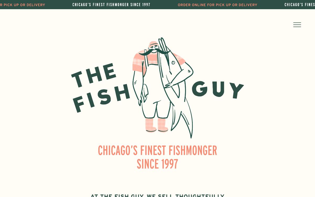
Chicago's fishmonger since 1997, supplying restaurants and locals with fresh fish, sushi-grade seafood and a made-to-order lobster roll counter.
- Industry
- Food retail and wholesale
- Award
- Qube Awards 2025, runner-up for Best Website Animations
- Website
- fishguy.com
Why it's on the list: the hand-drawn fishmonger character (and a man walking a lobster on a lead) gives a 30-year-old business a personality most shops would kill for. Under the illustration it's very practical: today's catch, pickup or delivery ordering, wholesale enquiries and recipes. It even lists staff benefits, which says a lot about the business.
What the best Squarespace sites have in common
None of these look like Squarespace, and that's the point. Every one has a custom layer on top of the platform: illustration, animation, bespoke typography or code that changes how the site behaves. But the custom work is never there for its own sake. It always serves the business: the storytelling on a clinic site, the motion on a training company, the split entrance on an architecture studio that serves two kinds of client.
The other thing they share is that someone made firm decisions about who the site is for before anyone opened the editor. Squarespace doesn't hold any of these back. It's the solid base that let each designer spend their time on what makes the site different.
Want your site on next year's list
Tell us what your business needs the website to do and we'll come back with a fixed quote.
Book a Discovery Call